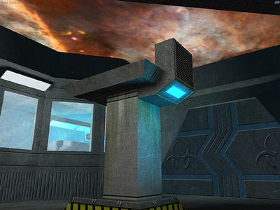
4.3– Color Coordinate Your Textures
There is nothing like looking at a level that someone has thrown together with all sorts of textures they have found from off the web. This one and that one were selected for who-knows-what reason and almost randomly applied to walls, floors and whatever else needed a texture. Some people will take a bit more care and make sure that a wood texture is used for a wood surface and stone for stone, but that may not be enough. Textures should really be color coordinated in order to really make the level sing. This is a really a tough area to get into and I personally consider color coordination a gift. Some people have it naturally (or so it seems) and some do not. I am not one of those ones that can just come up with matching color sets. Therefore I have to work hard at it. I actually have a few color programs and books to help me through this process.
There are alternatives to purchasing software or books to help you through this process, though. You can use the Internet as a point of research. Look for images on the web that catch you attention. Look at how they used color to get your attention and what combinations they used together. See how they work (or don't work) and why. Often times I will drop an image or an entire web page screen shot into my paint program and, using the paint dropper tool, will “collect” colors from off of an image and use them as a guide to create a color set. Any textures I create for a particular area should have a root in one of the colors in the set.

Return to Part 4.2 - Using Texture Scaling
Go to Part 5 - Let it Shine!