|
0 registered members (),
3,544
guests, and 4
spiders. |
|
Key:
Admin,
Global Mod,
Mod
|
|
|
 Re: A7 logo contest
[Re: inFusion]
#107827
Re: A7 logo contest
[Re: inFusion]
#107827
01/24/07 15:05
01/24/07 15:05
|
Joined: Jan 2004
Posts: 2,013
The Netherlands
Excessus

Expert
|
Expert
Joined: Jan 2004
Posts: 2,013
The Netherlands
|
Quote:
i htink it should be no reference to C-lite in logos caus it's a language not
the engine :
Torque and BV engine or other don't put any reference to Torque Script or Angel script in their logo and it's useless (just my opinion )
Yes, for once I agree with you. There wasn't a "Look we've got shaders" in the A6 splashscreen either, just because that was a new feature. This banner will be visible to people who play the published games, they most likely have no idea what lite-c is.
EDIT: damn, I had misread jcl's second post as stating the lightbulb was optional, but that was about the "lite-c" text. Well my banners are crap anyway 
Also I think this isn't so much a logo contest, more a banner contest. The photoshop startup window doesn't contain a logo either (and JCL mentioned the photoshop startup window..).
So, here are my attempts. I hope the effects aren't overdone, but I don't like a totaly abstract banner for the engine window..
Version 1, black & white:


How it'll look with a window attached:

And a simpler one with less effects:

And another one..

The text in the last two can be changed or removed, and the 'A7' block can be placed right or left.
BTW, jcl, since the A6 splashscreen is baked into the homepage, the homepage will have to be redone aswell. Have you thought about that? And if it has to be updated anyway, please have those horrible compression artifacts removed from it..
|
|
|
Re: A7 logo contest
[Re: Excessus]
#107828
01/24/07 15:48
01/24/07 15:48
|
Joined: Jan 2003
Posts: 4,615
Cambridge
Joey
Expert
|
Expert
Joined: Jan 2003
Posts: 4,615
Cambridge
|
well, anyway, just a few tips. wether or not they're good is personal taste.
its A7 not a7
the engine is called "A7", not lite-c or whatelse.
even though jcl gave you the lightbulb for "lite c", it's a difficult design element. i'd advice you to abstract it
make the reader get what "A7" is without telling him ("this is a game engine, you know...")
i hate lens flares.
don't use pixel effects for the logo part. never use any predefined pixel effects anywhere in a logo.
use colors that match, and don't use thousands of colors for the logo.
use a high contrast. complementary or triadic colors may match better than two grey tones
if you intend to make a splash screen, keep in mind that splash screens do nothing but emphasize a logo's message, so it's not the splash screen that has to catch our eyes, it has to direct our view to the logo
don't use any redundant information in the logo
well... good luck
Last edited by Joey; 01/24/07 15:50.
|
|
|
Re: A7 logo contest
[Re: Joey]
#107829
01/24/07 16:09
01/24/07 16:09
|
Joined: Feb 2006
Posts: 2,185
mpdeveloper_B
Expert
|
Expert
Joined: Feb 2006
Posts: 2,185
|
so far i'm the only one with just black and white in the logo  if anyone didn't notice jcl's post: Quote:
Wow, already remarkable entries with some nice ideas!
- Some info: we don't need more text in the image than "A7" and maybe "lite-C". The web address and "Gamestudio" will be visible in the engine startup message anyway, and thus is not needed in the image.
- Take care of the 'fade to white' and 'fade to black' requirement - unless a border is part of the image idea.
- The format should be either square, or like a banner with a width to height ratio of about 4:1 or 5:1.
- Avoid very small details, as the final horizontal size will be only 480 pixels for the banner, and about 200..250 pixels for a square image. When posting entries here, use that size.
- The image will be displayed in 8 bit, so too many smooth color or brightness ranges should also be avoided.
- Last but not least: There can be more than one winner! (when we can't decide between some entries)
actually, i also would prefer a conitec decision, because it would only be fair, they are going to be displaying it in 8bit, as he noted above, so try and use less colors, if you want to know how they will look in 8bit, get a program like IrFanView, it allows you to decrease color depth as well as resize and keep the aspect ratio, and adding effects to your entries
i myself believe that the logo should be simpler, which is why i made my logos the way they are, i just hope it's a conitec decision, as i mentioned before...
- aka Manslayer101
|
|
|
Re: A7 logo contest
[Re: inFusion]
#107831
01/24/07 16:30
01/24/07 16:30
|
Joined: Feb 2006
Posts: 2,185
mpdeveloper_B
Expert
|
Expert
Joined: Feb 2006
Posts: 2,185
|
well, image manipulation is no cakewalk, but i think your entry was good, however, jcl said that all the logos will be viewed in 8bit, so doing huge image manipulation and effects would make the image look really bad. @jcl: i'm keeping my original idea, but i'll be altering it a bit as well, here are some more entries: white: 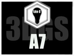 black: 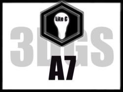 white: 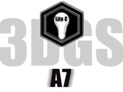 black: 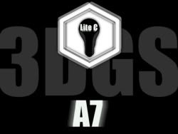 i personally prefer the black background versions, but that's just me a quick question, you say that for square entries it should be 250 or 200 px, is 250 by 188 ok?
Last edited by Manslayer101; 01/24/07 16:30.
- aka Manslayer101
|
|
|
Re: A7 logo contest
[Re: mpdeveloper_B]
#107832
01/24/07 17:05
01/24/07 17:05
|
Joined: Jul 2002
Posts: 4,436
Germany, Luebeck
Xarthor
Expert
|
Expert
Joined: Jul 2002
Posts: 4,436
Germany, Luebeck
|
The idea of the "7" being attached to the "A" occupied my mind and I came up with this one:  (8 Bit, 400x100 pixel²) EDIT: Yes SteinImOfen the seven is mirrored because otherwise I think I might be read as "7 A" and not "A 7" but maybe its too hard to recognized as a 7 dunno.
Last edited by Thunder; 01/24/07 17:21.
|
|
|
Re: A7 logo contest
[Re: mpdeveloper_B]
#107834
01/24/07 17:33
01/24/07 17:33
|
Joined: Nov 2004
Posts: 888
beegee
User
|
User
Joined: Nov 2004
Posts: 888
|
First, it's my opinion whether if it's right or wrong. But i think it goes into the right direction. I think JCL don't want that we should make the A7 logo / Conitec logo / 3dgs logo. And we don't have to make a splash screen like in A6, because there it was shown after the engine startup screen. For eaxample here the Photoshop startup screen: 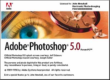 So now we should design a splash screen which is part of the startup screen. As you can see from the picture we only should design the upper part. But i think such things are a way too old, nowadays more and more companys have such startups: 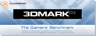 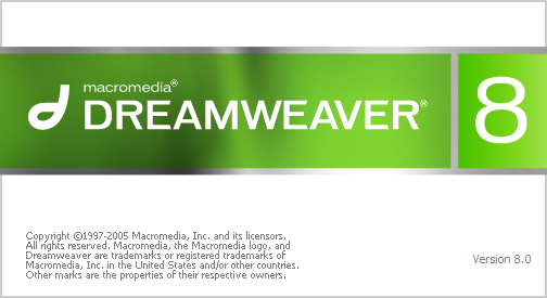 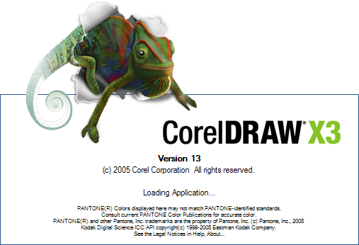 @jcl: Is it allowed to use pictures with transparency such like the splash screen above (corel draw) ? PS: Normally the white thing above the blue line isn't shown. @jcl: will the user be able to change the splash screen? (not necessary in my opinion) @jcl: Something like the splash screen of 3DMark would be the best for A7/GameStudio. It has a professional look, is easy to made and it fits perfect for any games made with GS. Plus, it has not soo much white in the splash screen. @jcl: I think we don't need an additional black splash screen.
Fratch - Newer statistics panel for GameStudio
|
|
|
|


