I had a blast with the one demo you released a long, long time ago (probably july or august?), so its great to know that this game is almost finished! Plus, it seems like you've made lots of improvements. Did you change the inertia-thing and the camera? Those two issues were bothering me most.
Here are some thoughts on the screenshots, but feel free to ignore them, because ohmygod you have worked so long on it now and just want to be done with it. Or, maybe, thats not the case. You may still ignore it. I'm generous like that.
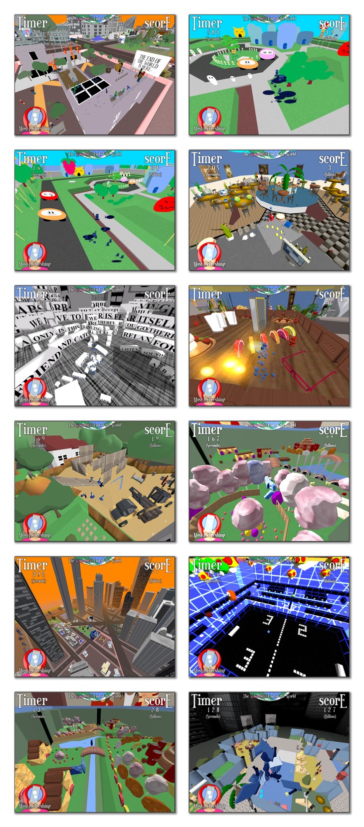
What is the "most refreshing" thing? I first thought it shows the last object taken - you know, lke in Katamari. But then, either the world is populated by glasses of water, that thing isn't finished or that assumption was faulty in the first place - a fate that would be definately not be "most refreshing".
So... is one of my three alternatives correct? Or did you manage to cleverly mislead me?
Continuing with the panels, I think the layout of the score and timer-panels is weird. We have "TIMER" and "SCORE" in large letters (with huge "T" and "E" - undoubtly a hidden message) and then, in tiny little numbers, the actual amount of time/score. Thats cool for the first playthrough, but then, I already know where time and score is placed. Then, a quick look should be enough to know how much seconds are left and how much million points I got. So maybe, just switch it around and make the number large and the text smaller, or make the number, say, red and place it upon the text and make it larger or something along those lines. Just that the number is what I see first and not the text.
The style of your game is, at least in my opinion, not so easy to understand when seeing it in stills. Its still there, though.
I think neither of the first three screenshots should be at the beginning - this is because they all don't show the concept that well. I create a huge badass robot out of... things I collected - but in the first three screenshots, it looks like thes eobjects were placed there, and its not easy to see the reason
why they're placed there (obviously because they're part of a gigantic robot standing there, but as its not quite complete, you cant make it out). So I'd simply rearrange the order of the shots. Better yet, make one where it is really obvious that there is that robot made out of objects - there is no one that puts that aspect of the game - which from my understanding has at least an important role to the game - really in the spotlight.
The rice cakes - which I'm going to assume are circular and flat in nature - are simple and have that kind of somewhat japanese "aww"-factor thats all the rage these days, you managed to capture that look pretty well

- it's just painfully obvious that these are sprites. Maybe you could make them small disks where you round off the edges or something as to minimize that effect while keeping the stylish look?
In the fourth screenshot, the glass appears to be filled with magical juice - its super bright! Or did you alter the screenshots afterwards? How scandalous. And then, there is screenshot # 8, which is even more guilty of that
horrible crime.
The one with the words is amazing and weird at the same time - I'm basically collecting words, my own little story, book, autobiography with made up details! Are the words sorted by theme or any other criteria? Does a voice read them out loud? (Probably not, but asking anyway). And are there other objects other than white cubes with text on them? Like, single letters (geometry, not blocks, can easily be made with many modelling applications), or typewriters, or sheets of paper, or pens, or inkpots or dragons?
I really like screenshot # 9. It seems to have a nice size, great contrasts with the heights and size of objects, which fits the theme and has fog and orange color. It adds depth, adding to the height. Can you collect those towers, too?
All in all - it seems that there is great diversity in the levels - fantastic! I loved how in Mario Galaxy, each level was something new, your game seems to have that, too. Many ideas - a lot of them unexpected - mix things up, and given that the story makes no sense whatsoever (yeah, sorry, but then, that wasn't the goal, right?), you really have that freedom to do so, and it totally works. I like the style, even though its so simple, and the clean look it has. I have no idea if the game includes your humor as well (although judging by the story, there is a slight possibility), which is another plus.
I really wish you good luck!
There was that small article about your game in a magazine, right? How did they find you? And how did it affect traffic and downloads? Or are you not allowed to tell this to the general public, by which I mean us?
EDIT: I can't believe I replied to a topic named "You too can have excitement of a voluptous nature". Can't wait to be found on google with that.