Gamestudio Links
Zorro Links
Newest Posts
Purchase A8 full licence version
by NeoDumont. 05/13/26 20:17
Black Book, 4th edition
by TipmyPip. 05/11/26 08:40
ZorroGPT
by TipmyPip. 05/09/26 11:58
No errors in the command line
by jcl. 05/08/26 10:59
Z9 getting Error 058
by k_ivan. 04/25/26 19:13
AUM Magazine
Latest Screens
Dorifto samurai
Shadow 2
Rocker`s Revenge
Stug 3 Stormartillery
Who's Online Now
1 registered members (NeoDumont), 5,542 guests, and 19 spiders.
Key: Admin, Global Mod, Mod
Newest Members
curry, DhandhaxKrsna, Specific, DeepxKalsi, codestar42
19215 Registered Users
Previous Thread
Next Thread
Print Thread
Rate Thread
Page 4 of 5 1 2 3 4 5
Re: phosphor games logo mockup [Re: Xarthor] #212310
06/21/08 14:38
06/21/08 14:38
Joined: Oct 2007
Posts: 5,211
İstanbul, Turkey
Quad Offline
Senior Expert
Quad  Offline
Senior Expert

Joined: Oct 2007
Posts: 5,211
İstanbul, Turkey
the font on the middle one fits best imo.


this one.

Last edited by Quadraxas; 06/21/08 14:40.

3333333333
Re: phosphor games logo mockup [Re: Quad] #212312
06/21/08 14:40
06/21/08 14:40
Joined: Jan 2003
Posts: 4,615
Cambridge
Joey Offline OP
Expert
Joey  Offline OP
Expert

Joined: Jan 2003
Posts: 4,615
Cambridge
@xarthor: it was just a joke, nevermind ^^
@rest: last chances for opinions...

edit: my last drafts: which letter distance for "pg" looks best? and what do you think about having a version for smaller scaling with thicker lines for the letters? i've added differently coloured versions to make a comparison easier.


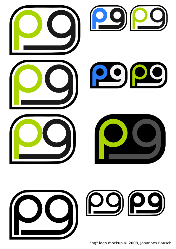
comments for the last time?

thanks, joey.

Last edited by Joey; 06/21/08 15:04. Reason: added some last drafts.
Re: phosphor games logo mockup [Re: Joey] #212320
06/21/08 15:31
06/21/08 15:31
Joined: Apr 2007
Posts: 582
Germany
Poison Offline
User
Poison  Offline
User

Joined: Apr 2007
Posts: 582
Germany
I think this one looks perfect, it has got a great font and a great design, it just fits perfect!! :


Edit: the 8th looks good, too.


Everything is possible, just Do it!
Re: phosphor games logo mockup [Re: Poison] #212329
06/21/08 16:02
06/21/08 16:02
Joined: Aug 2003
Posts: 2,122
Berlin, Germany
checkbutton Offline

Expert
checkbutton  Offline

Expert

Joined: Aug 2003
Posts: 2,122
Berlin, Germany
No, I think the black background is better...
with white and green.


I don't have a homepage, for god's sake!
Re: phosphor games logo mockup [Re: checkbutton] #212330
06/21/08 16:06
06/21/08 16:06
Joined: Oct 2007
Posts: 5,211
İstanbul, Turkey
Quad Offline
Senior Expert
Quad  Offline
Senior Expert

Joined: Oct 2007
Posts: 5,211
İstanbul, Turkey
these ones imo:


3333333333
Re: phosphor games logo mockup [Re: Quad] #212335
06/21/08 16:24
06/21/08 16:24
Joined: Aug 2003
Posts: 2,122
Berlin, Germany
checkbutton Offline

Expert
checkbutton  Offline

Expert

Joined: Aug 2003
Posts: 2,122
Berlin, Germany
as i said... black background, with green and white.


I don't have a homepage, for god's sake!
Re: phosphor games logo mockup [Re: Joey] #212376
06/21/08 22:25
06/21/08 22:25
Joined: Sep 2002
Posts: 8,177
Netherlands
PHeMoX Offline
Senior Expert
PHeMoX  Offline
Senior Expert

Joined: Sep 2002
Posts: 8,177
Netherlands
Originally Posted By: Joey
like that?


From a stylistic point of view I really like this... the actual name isn't very clear though. That's not because it isn't written in full or anything, but because the two letters P and G aren't obvious enough in that they represent a (bigger) name. Think of the EA logo where the E and A letters almost explode in your face when it comes to how obviously they represent Electronic Arts.

Cheers


PHeMoX, Innervision Software (c) 1995-2008

For more info visit: Innervision Software
Re: phosphor games logo mockup [Re: PHeMoX] #212408
06/22/08 10:26
06/22/08 10:26
Joined: Jan 2003
Posts: 4,615
Cambridge
Joey Offline OP
Expert
Joey  Offline OP
Expert

Joined: Jan 2003
Posts: 4,615
Cambridge
well, i decided not to use a specific colour. but i'm still not sure about the font, so i chose to place a poll here.


thanks again for all your comments. and vote! wink

joey.

Which font fits best?
single choice
Votes accepted starting: 06/22/08 10:25
You must vote before you can view the results of this poll.
Re: phosphor games logo mockup [Re: Joey] #212409
06/22/08 10:35
06/22/08 10:35
Joined: Oct 2007
Posts: 5,211
İstanbul, Turkey
Quad Offline
Senior Expert
Quad  Offline
Senior Expert

Joined: Oct 2007
Posts: 5,211
İstanbul, Turkey
the shape of p and g fits better on second font imo.


3333333333
Re: phosphor games logo mockup [Re: Quad] #212412
06/22/08 10:52
06/22/08 10:52
Joined: Jan 2003
Posts: 4,615
Cambridge
Joey Offline OP
Expert
Joey  Offline OP
Expert

Joined: Jan 2003
Posts: 4,615
Cambridge
that's correct. but the first font reads better and has better proportions under the "pg" logo.

Page 4 of 5 1 2 3 4 5

Gamestudio download | Zorro platform | shop | Data Protection Policy

oP group Germany GmbH | Birkenstr. 25-27 | 63549 Ronneburg / Germany | info (at) opgroup.de

Powered by UBB.threads™ PHP Forum Software 7.7.1