|
0 registered members (),
5,489
guests, and 68
spiders. |
|
Key:
Admin,
Global Mod,
Mod
|
|
|
 Re: Cover Art Poll II
[Re: Joey]
#85178
Re: Cover Art Poll II
[Re: Joey]
#85178
08/08/06 19:41
08/08/06 19:41
|
Joined: Aug 2003
Posts: 448
Pluto
SlyBoots

Senior Member
|
Senior Member
Joined: Aug 2003
Posts: 448
Pluto
|
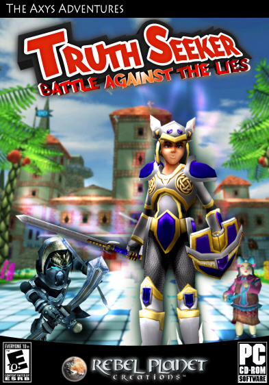
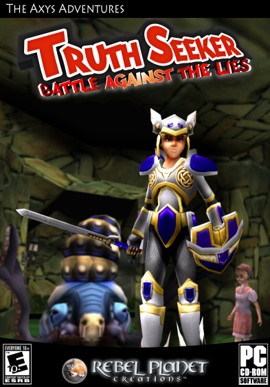
Really, if you just add something (like maybe a small character) near the players head in the dark "alternative lightening" one I think it'd be better than the lighter one.
3DSK Human Photo References for 3D Artists and Game Developers
|
|
|
Re: Cover Art Poll II
[Re: Joey]
#85180
08/08/06 20:11
08/08/06 20:11
|
Joined: Mar 2006
Posts: 2,758
Antwerp,Belgium
frazzle
Expert
|
Expert
Joined: Mar 2006
Posts: 2,758
Antwerp,Belgium
|
Looking nice Joey ^^
Cheers
Frazzle
Antec® Case
Intel® X58 Chipset
Intel® i7 975 Quad Core
8 GB RAM DDR3
SSD OCZ®-VERTEX2 3.5 x4 ; HD 600 GB
NVIDIA® GeForce GTX 295 Memory 1795GB
|
|
|
Re: Cover Art Poll II
[Re: frazzle]
#85181
08/08/06 21:12
08/08/06 21:12
|
Joined: Aug 2003
Posts: 7,440
Red Dwarf
Michael_Schwarz
Senior Expert
|
Senior Expert
Joined: Aug 2003
Posts: 7,440
Red Dwarf
|
i like the first one more, though, the dark "border" could be smaller. btw, is it me, or is the hero (axys?) squinting? 
"Sometimes JCL reminds me of Notch, but more competent" ~ Kiyaku
|
|
|
Re: Cover Art Poll II
[Re: Michael_Schwarz]
#85182
08/08/06 21:35
08/08/06 21:35
|
Joined: Sep 2002
Posts: 1,381
New Brunswick, Canada
Ayrus
Serious User
|
Serious User
Joined: Sep 2002
Posts: 1,381
New Brunswick, Canada
|
The top one is the better choice imo as the game name is truth seekers, truth and good is generally associated with white/good, so darkness wouldn't work imo..
Regards,
Ayrus
suprised my account is still active....
|
|
|
Re: Cover Art Poll II
[Re: Ayrus]
#85183
08/08/06 23:49
08/08/06 23:49
|
Joined: Jul 2002
Posts: 4,436
Germany, Luebeck
Xarthor
Expert
|
Expert
Joined: Jul 2002
Posts: 4,436
Germany, Luebeck
|
Nice work Joey. I voted for the first one, but if you dark down the second on a bit and add a white glow around the hero so he stands out I think it would be as good as the bright one maybe even better  edit: oh and maybe choose an different pose for the hero. Maybe sword straight up and the shield like he is going to protect himself would make the cover a bit more aggressiv. At the moment it looks like the hero is stoned or something.
Last edited by Thunder; 08/08/06 23:53.
|
|
|
Re: Cover Art Poll II
[Re: Xarthor]
#85184
08/09/06 00:22
08/09/06 00:22
|
Joined: Aug 2002
Posts: 572
Toronto
MadMark
User
|
User
Joined: Aug 2002
Posts: 572
Toronto
|
Just my 2¢ but the darker image is more likely to appeal to the teen crowd. BTW, both look very good.
Cheers!
Mark
People who live in glass houses shouldn't vacuum naked.
|
|
|
Re: Cover Art Poll II
[Re: MadMark]
#85186
08/09/06 00:51
08/09/06 00:51
|
Joined: Feb 2006
Posts: 371
New England
Rad_Daddy
Senior Member
|
Senior Member
Joined: Feb 2006
Posts: 371
New England
|
Beeing a teen myself, I like the first one  . Cant speek for every teen out there, but thats my personal opinion. Regards, Raddaddy
"Read not to contradict and confute, nor to find talk and discourse, but to weigh and consider." Sir Francis Bacon
www.deckscapedesign.com
|
|
|
|